Paddleboarder AI Design System
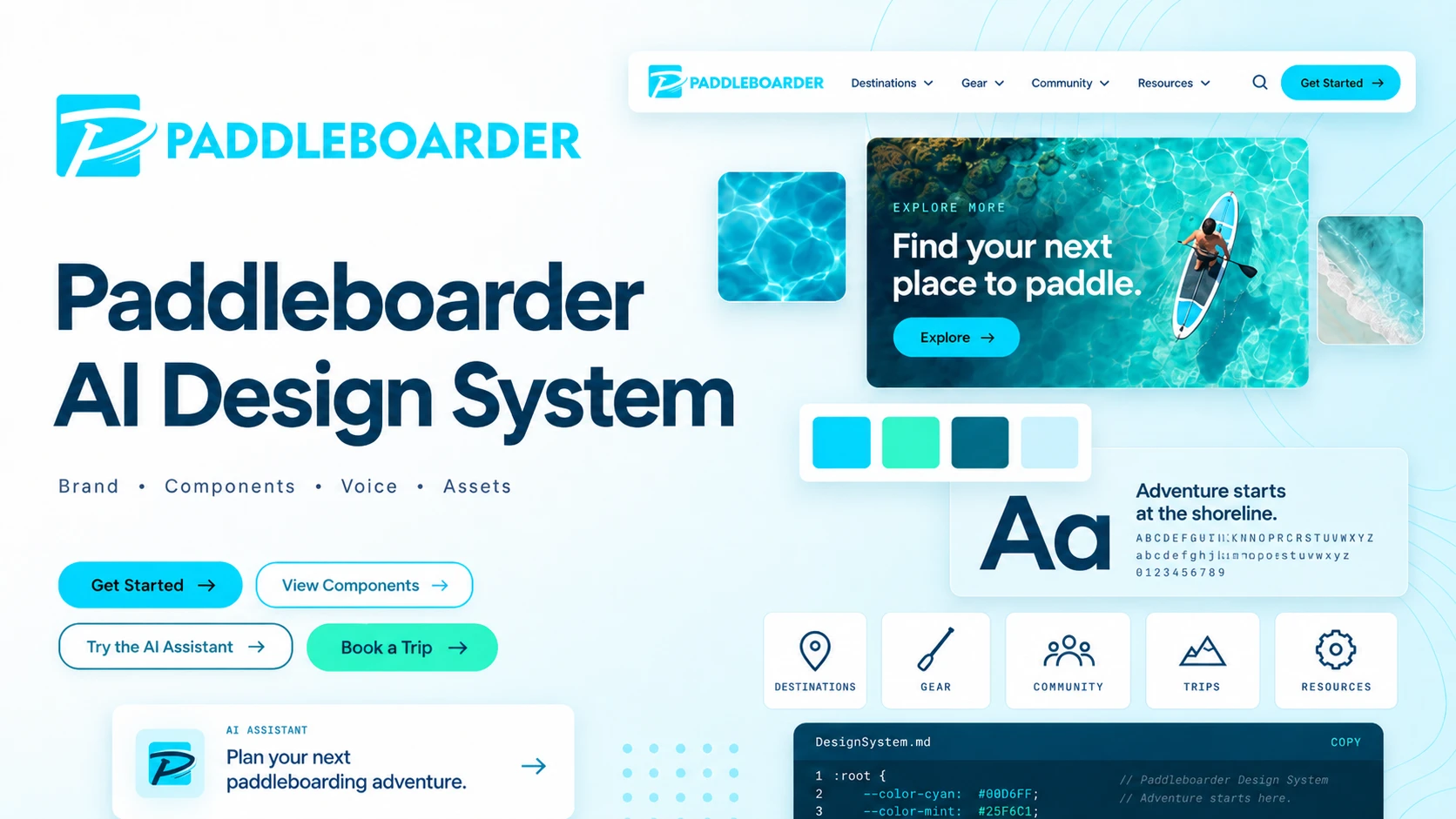
We STANDUP for mind, body & soul through paddleboarding.
Color story: Cyan = surface water // Mint = shallows // Teal = depth & trust. A single cool spectrum, no warm counterpoint.
Color system
The core palette from the Paddleboarder Brand Guideline. The extended ramps supply tints, shades, and functional states.
★ Core palette (brand-guideline values)
Extended ramps (tints/shades + states)
Functional
Gradients & backgrounds
Every gradient runs cyan → mint or fades into deep teal. One dominant gradient per view.
Typography
DIN Next LT Pro for everything: headers, body, UI, buttons. ITC Avant Garde Gothic Bold is reserved for the wordmark and rare display moments — one weight only, used sparingly.
Logo
Vectors in assets/logo/ — full lockup for headers, footers & decks; the mark for nav and tight spaces.


Cards
Feature / destination cards. Water-bordered vs mint-bordered variants distinguish depth from surface.
Rent a board almost anywhere
1,400+ rental businesses listed worldwide — search by where you are or where you're headed.
Find your local community
Group paddles, meetups, and people who'll wave you over at the launch. Every level welcome.
Safety, stated plainly
Wear a leash, wear a PFD, check the wind, and tell someone your plan. Simple, never scary.
Stats blocks
Reach presented as a data list. Every figure carries its provenance, so a reader can tell a verified number from sample content at a glance.
Only the 1,400+ figure is verified from paddleboarder.com. Anything marked Sample must be confirmed before it ships.
Hero section specimen
Flat Shoreline ground, H1, lead, dual CTA — the canonical marketing page opener.
Adventure starts at the shoreline.
Calm lakes, slow rivers, and open coastline: destination guides with launch info, conditions, and skill level for every spot.
AI design tells (Don’ts)
Patterns that make it obvious an agent is reaching for the same default choices everywhere. Distilled from Impeccable and reconciled with Paddleboarder brand rules.
Layout & containers
- ✗Colored side-tab border on cards
- ✗Accent border on a rounded element
- ✗Cards nested inside cards
- ✗Rounded-square icon tile above a heading
- ✗Same-size icon + heading + text card grid as the page structure
- ✗Hero-metric template (big number, small label, stats)
- ✗One spacing value used everywhere
- ✗Section numbers 01 / 02 / 03 on every heading
Typography
- ✗Inter, Roboto, Geist, Fraunces, Plus Jakarta Sans, Space Grotesk
- ✗Type steps closer than a 1.25 ratio
- ✗Eyebrow labels above every section by reflex
- ✗Tiny uppercase pill chip above a hero headline
- ✗Oversized italic serif hero headline
- ✗A full-sentence headline blown up to display size
- ✗Letter-spacing tighter than
-0.04em - ✗Monospace as a costume for “technical”
- ✗Emoji or unicode glyphs standing in for icons
Color & light
- ✗Generic purple→blue / violet→cyan gradient ramps
- ✗Cream or beige as the default “tasteful” ground
- ✗Gradient text on headings or metrics
- ✗Zero-offset colored glow shadows
- ✗Radial spotlight haze floating behind a hero
- ✗Hard offset shadows (
4px 4px 0) - ✗Glass and blur as decoration
- ✗Gray text on colored backgrounds
- ✗Hairline border plus a wide diffuse shadow
- ✗Decorative grid-line or striped backgrounds
Motion, imagery & copy
- ✗Bounce or elastic easing
- ✗Decorative pulsing status dot
- ✗Blinking cursor where no input exists
- ✗Auto-scrolling marquee content
- ✗Animating width / height / padding / margin
- ✗Image scale or rotate on hover
- ✗Hero SVGs assembled from primitive shapes
- ✗Sparklines and progress rings as filler
- ✗Buzzwords: supercharge, world-class, next-generation
- ✗“X. Not Y.” cadence repeated across sections
Audit: what this system changed to comply
When these rules were adopted, an audit found the design system itself was using ten of them. They were fixed, not excepted — there are no standing carve-outs.
| Rule | Was | Now |
|---|---|---|
| 1 · 2 Side-tab border | The two test cards above carried a 3px amber left border on a rounded card | Plain hairline border |
| 4 Icon tile | 42px gradient tile above every card heading | Removed; the heading leads |
| 6 Hero metric | Four oversized gradient numbers in a band | A data list carrying provenance per row |
| 10 Type ratio | h1/h2 1.24, h4/h5 1.18, h5/h6 1.13 | Rebuilt on ~1.27; every step clears 1.25 |
| 11 · 12 Eyebrows | 13 uppercase eyebrows, one above nearly every section | Removed; headings carry hierarchy |
| 14 Display sentence | “The brand system behind Paddleboarder’s marketing.” | Shortened to a fragment; this header is now a supplied image |
| 20 Gradient text | background-clip:text on metrics and ad claims | Solid color |
| 22 Radial haze | The hero ground was two overlapping radial washes | Renamed --surface-hero, now flat Pale Cyan |
| 24 Decorative blur | backdrop-filter on nav and sidebar | Solid surfaces |
| 26 Border + shadow | Cards and hero carried both | One or the other, never both |
| 27 Grid lines | Grid field behind the directory visual and the LinkedIn ad | Removed |
| 34 SVG primitives | Directory “globe” built from CSS rings, dots, and beams | A real photograph from the asset library |
One clarification, not an exception. Rule 18 bans generic violet→cyan ramps. Paddleboarder’s cyan→mint comes from the Brand Guideline and is not that ramp — but never introduce a purple or violet one.
Design principles
The nine filters every marketing decision is tested against.